Banking Concept
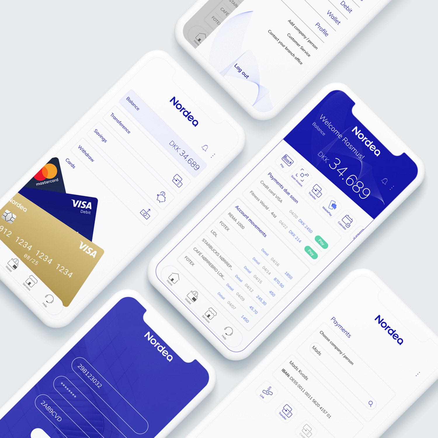
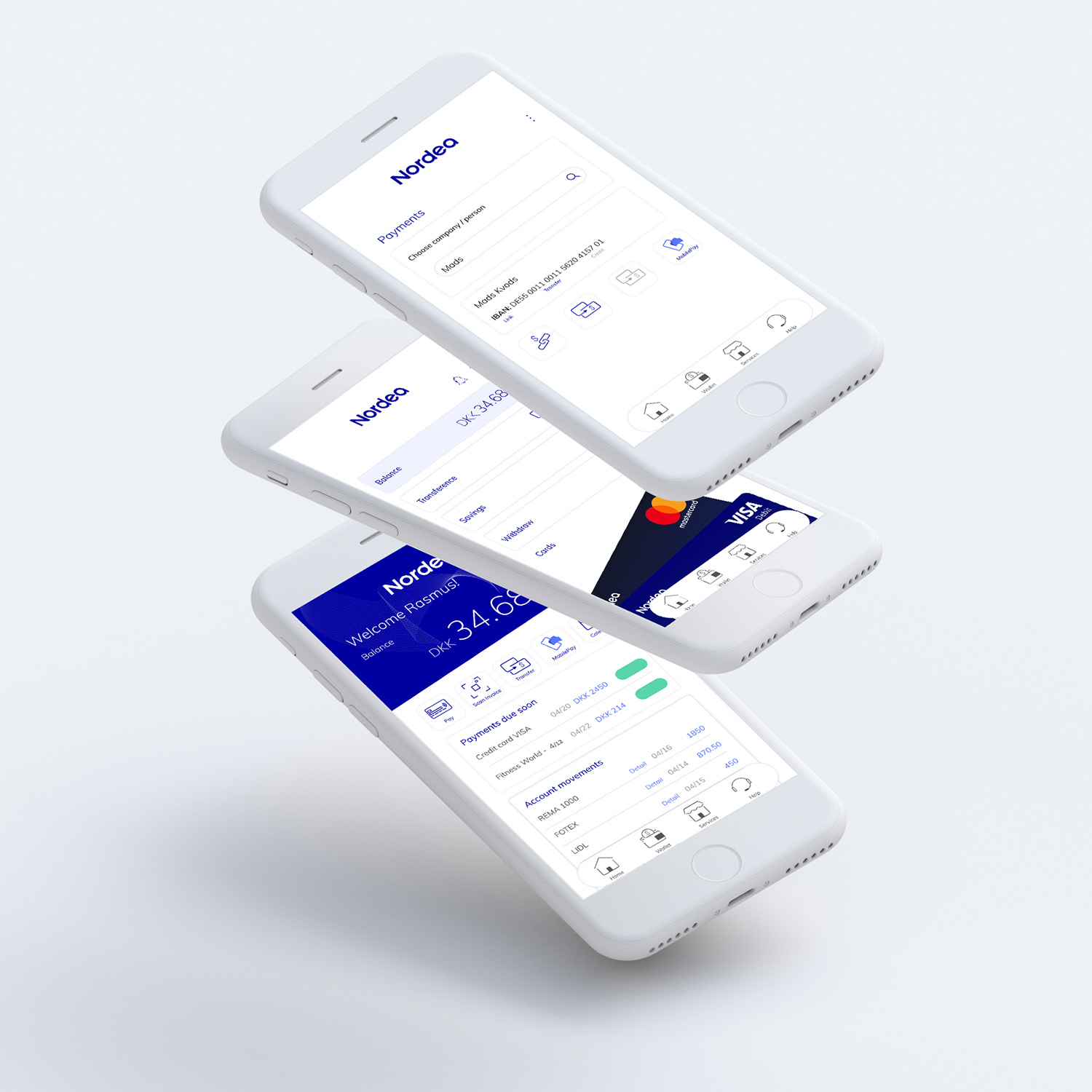
Concept design · Nordea reference · 2023A redesigned banking app concept using Nordea as reference, focused on making everyday money management more intuitive, from account overviews and wallet management to savings tracking and payments.
Observation
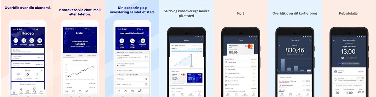
When reviewing existing banking apps, I noticed a tension between functionality and clarity. Many apps offer extensive features, but users often struggle to find what they need quickly. Navigation patterns rely heavily on hidden menus, dense dashboards, or horizontal scroll areas that reduce discoverability.
Intention
I used Nordea as a reference case to explore how a modern banking app could feel more intuitive while still supporting complex financial tasks. The intention was not to redesign branding, but to rethink structure and interaction around wallet management, account overviews, savings tracking, and daily financial actions.
The core question: how can a banking app reduce friction without oversimplifying financial control?
Research
Because I was not deeply familiar with banking systems at the beginning, I started with structured research: benchmarking leading banking apps, studying user forums to identify pain points, and analyzing how users navigate between accounts, payments, and savings.
This revealed three recurring needs: a fast financial overview, quick access to recurring actions, and clear visual hierarchy to support trust and comprehension.
Structural decisions
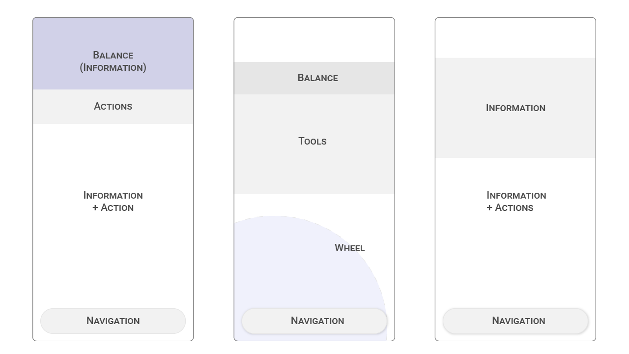
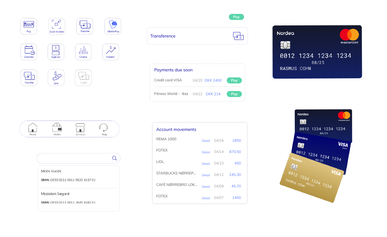
- Card-based layout to group related financial information
- Clear iconography with descriptive labels to reduce ambiguity
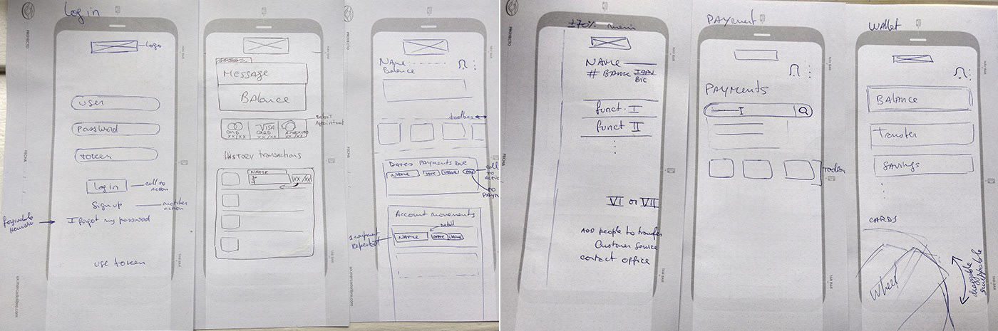
- Toolbar plus tab navigation for predictable interaction
- Guided flows to support less digitally confident users
Key features
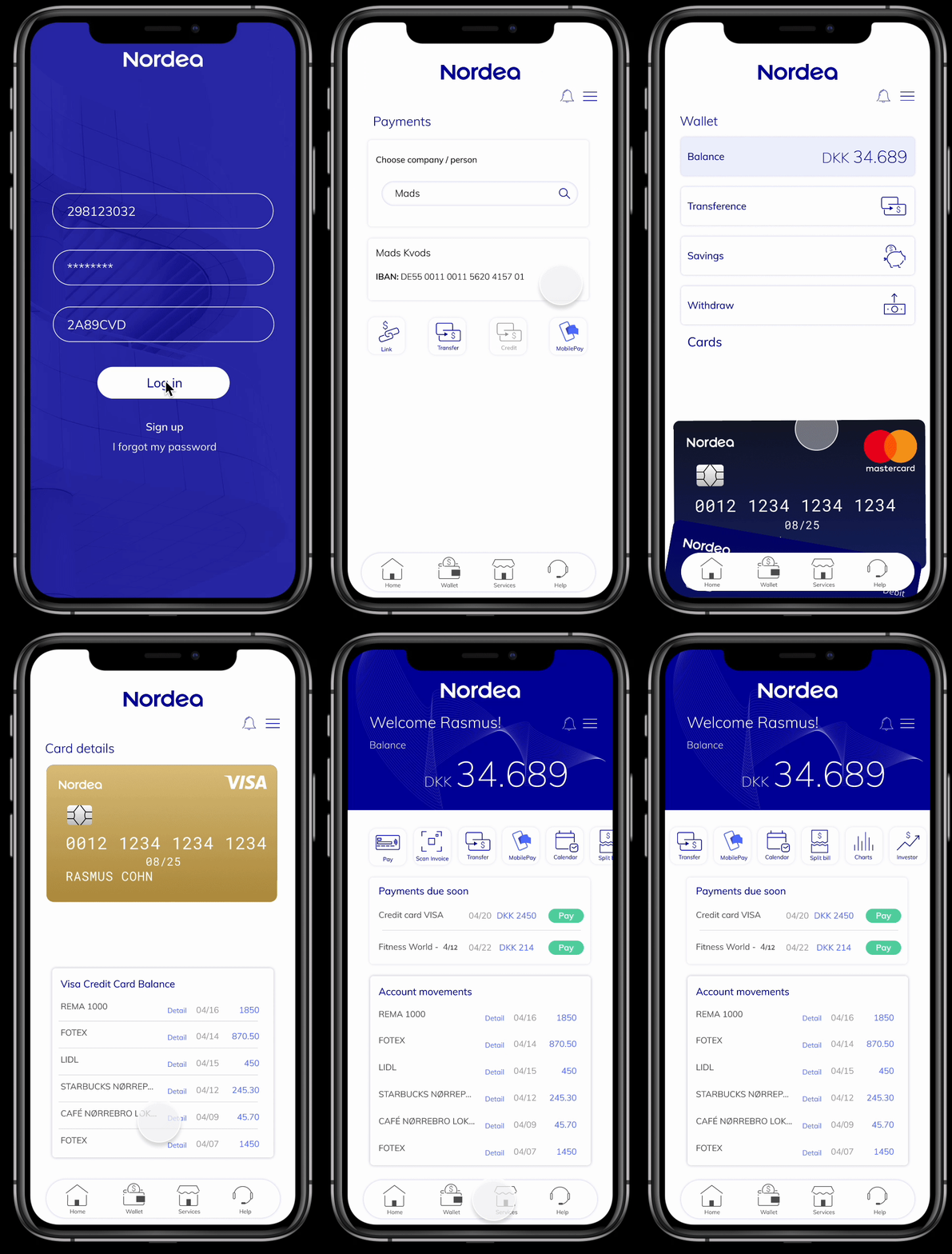
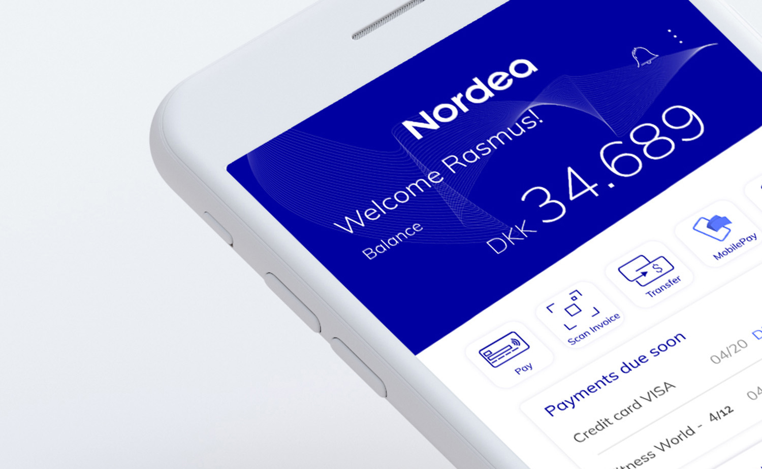
- Instant access to account balance and recent transactions
- Upcoming payments and savings overview
- Fast transfers and bill payments
- Predictive search to find payment contacts
- Interactive wallet section aligned with the home layout
Interaction layer
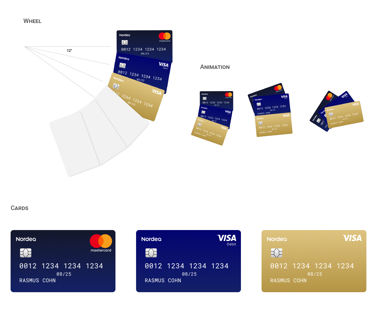
One distinctive element was a draggable card carousel. Instead of static payment options, users could swipe between cards as if selecting a physical card for NFC payments. This interaction aimed to create familiarity by mimicking real-world behavior.
Testing and iteration
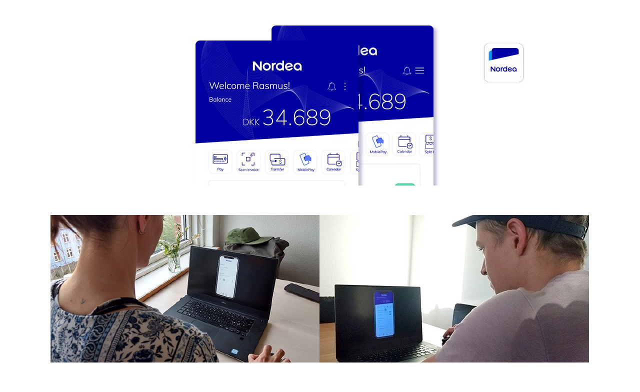
User testing highlighted usability friction and guided refinements:
- Menu accessibility: increased touch area for the three-dot menu
- Toolbar discoverability: added a subtle overflow indicator for horizontal actions
- Multi-account switching: identified as a key future improvement
What I learned
- Financial clarity beats visual minimalism: users don't want fewer features, they want better hierarchy.
- Discoverability is critical in banking: hidden functionality creates insecurity in high-trust environments.
- Familiarity builds confidence: physical metaphors (like draggable cards) help users feel grounded.
- Small usability details matter disproportionately: tap targets and hierarchy affect perceived reliability.