Structural Foundation
The web product was built as a desktop experience. It was not responsive. The architecture relied on a three column layout: assets on the left, main content in the center, and actions and transactions on the right.
This structure allowed users to see context and act efficiently. It worked well on large screens where simultaneous visibility was possible.
As the product expanded, complexity increased. More assets, more actions, more responsibility. The system needed to scale without overwhelming users.
At the same time, mobile was developed as a native application. It was not a responsive adaptation of the web. This was intentional. The goal was to create a dedicated native experience and encourage mobile adoption rather than simply shrinking the desktop interface.
Because of this, the three column logic could not be replicated.
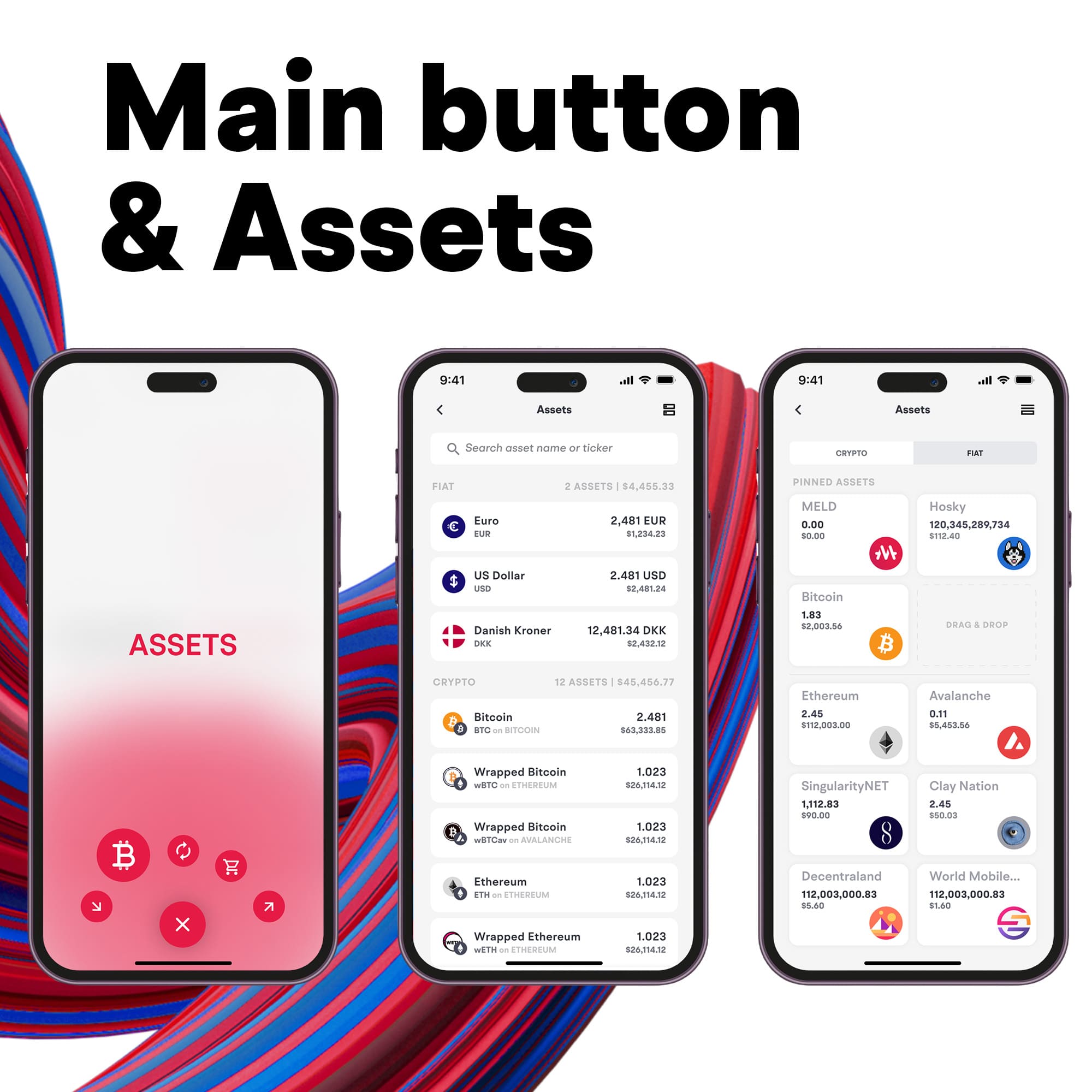
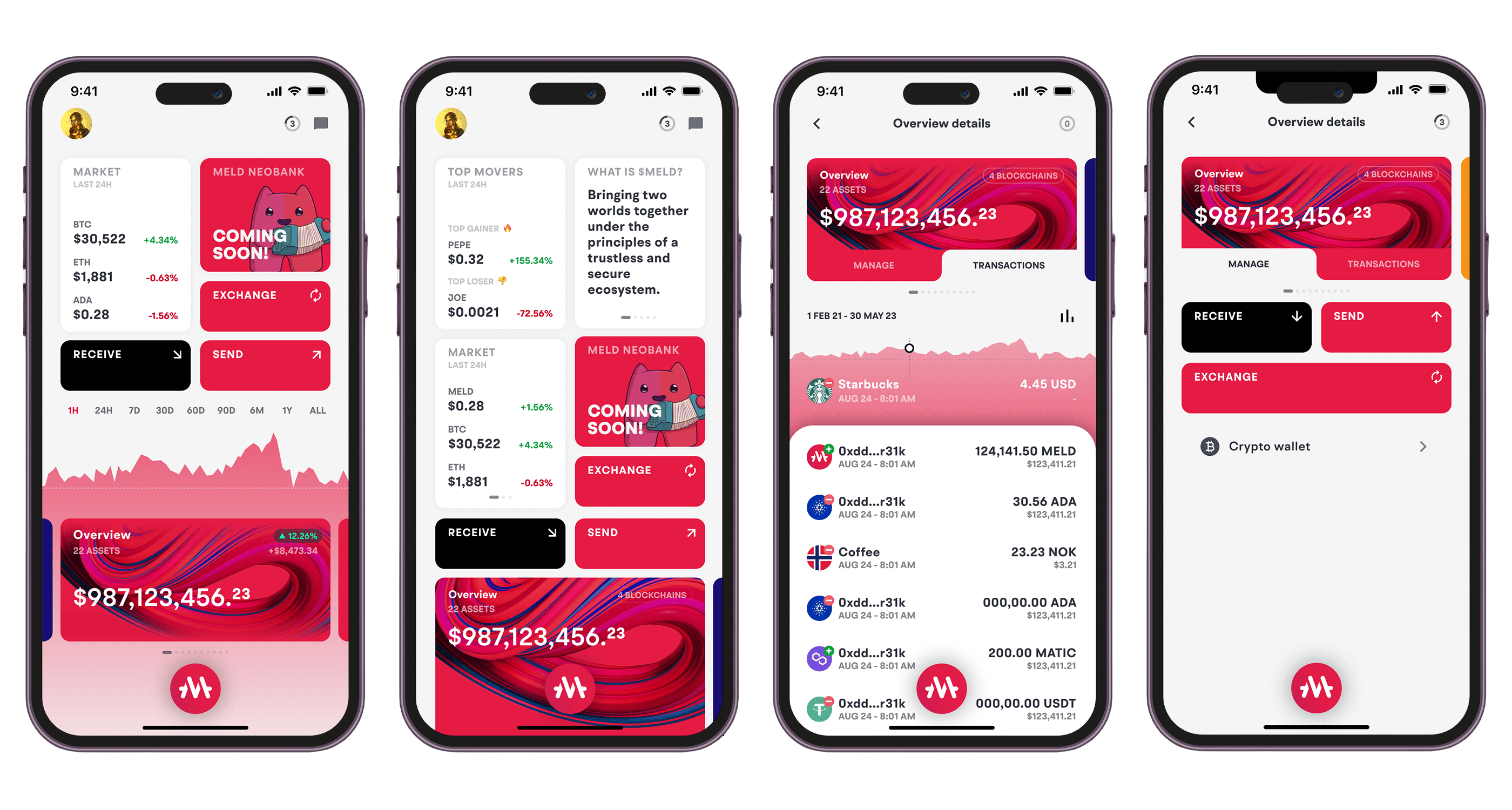
Mobile: Structural Adaptation
On mobile, the architecture had to change from spatial simultaneity to sequential interaction.
The central logic of the web, which lived across two columns, was merged into a card based structure. Each asset became a focused view instead of part of a multi panel system.
To navigate between assets, I introduced a press and hold interaction pattern. When users pressed and held on the current asset card, a horizontal strip of asset icons appeared. This allowed fast switching without exposing a permanent side panel.
This interaction replaced the left column of the web while preserving the same asset first mental model. Mobile was not a smaller version of web. It was a structural compression designed specifically for a native environment.
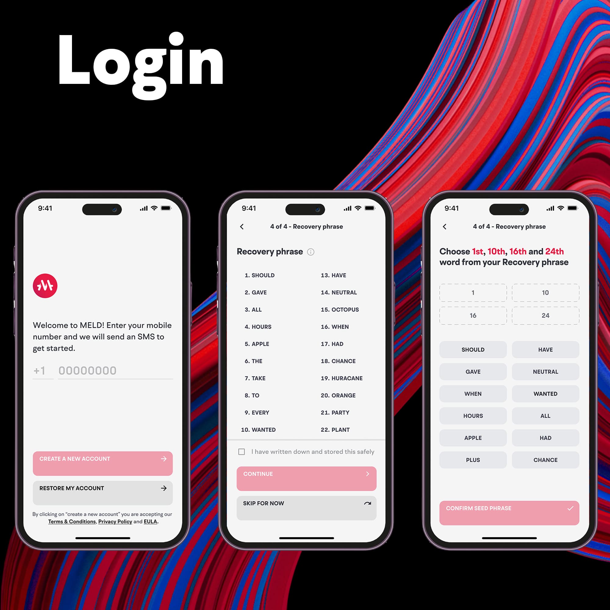
The Critical Friction: Onboarding
The largest drop off occurred during seed phrase verification.
The original onboarding required email or Google login, password, PIN, a mandatory 24 word seed phrase, and seed phrase verification.
Data showed users were not completing the verification step. The flow stacked too many security demands at once.
Instead of weakening security, I reorganized it. Security should not block entry. It should build progressively.
The changes were structural.
The redundant PIN was removed. This reduced friction and lowered the risk of forgotten credentials. It also prevented potential backend redundancy with duplicated profiles tied to the same wallet.
The onboarding flow was reduced from four steps to three. Seed phrase verification became skippable.
A persistent security banner was introduced inside the wallet and remained visible until the seed phrase was verified and the account fully secured. This allowed users to explore the product while maintaining clear and continuous pressure toward completing security.
As a result, churn decreased and Daily Active Users increased by 70%.
Outcome
Across web and mobile, the product shifted from rigid protection to structured trust. Security was not removed. It was redistributed in a way that improved activation without compromising system integrity.