Segurline
Web design · Brand · Insurance B2C · 2018 → 2020Segurline needed a comprehensive redesign to unify a fragmented online presence. The brief: streamline navigation, cut friction, and improve conversion through clearer structure and tone.
Observation & intention
Segurline's online presence was split across multiple microsites. Fragmentation created inconsistent navigation, duplicated content, and a high-effort journey for customers trying to compare products or reach service actions.
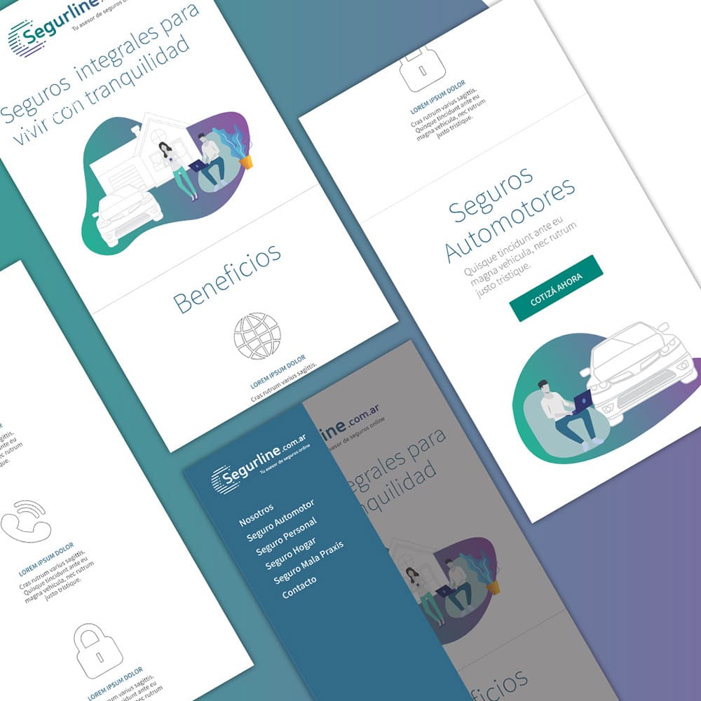
The intention was to consolidate the experience into a single, coherent platform: easy to scan, built around how users choose insurance, not how internal services had been historically separated.
Research & user insights
With limited direct access to customers, I ran an in-depth interview with the business owner, who had extensive experience guiding clients through their options. From that I extracted key insights into needs, behaviours and friction points.
Two proto-personas (different age groups and financial contexts) anchored the decision paths and content priorities that followed.
Design strategy & challenges
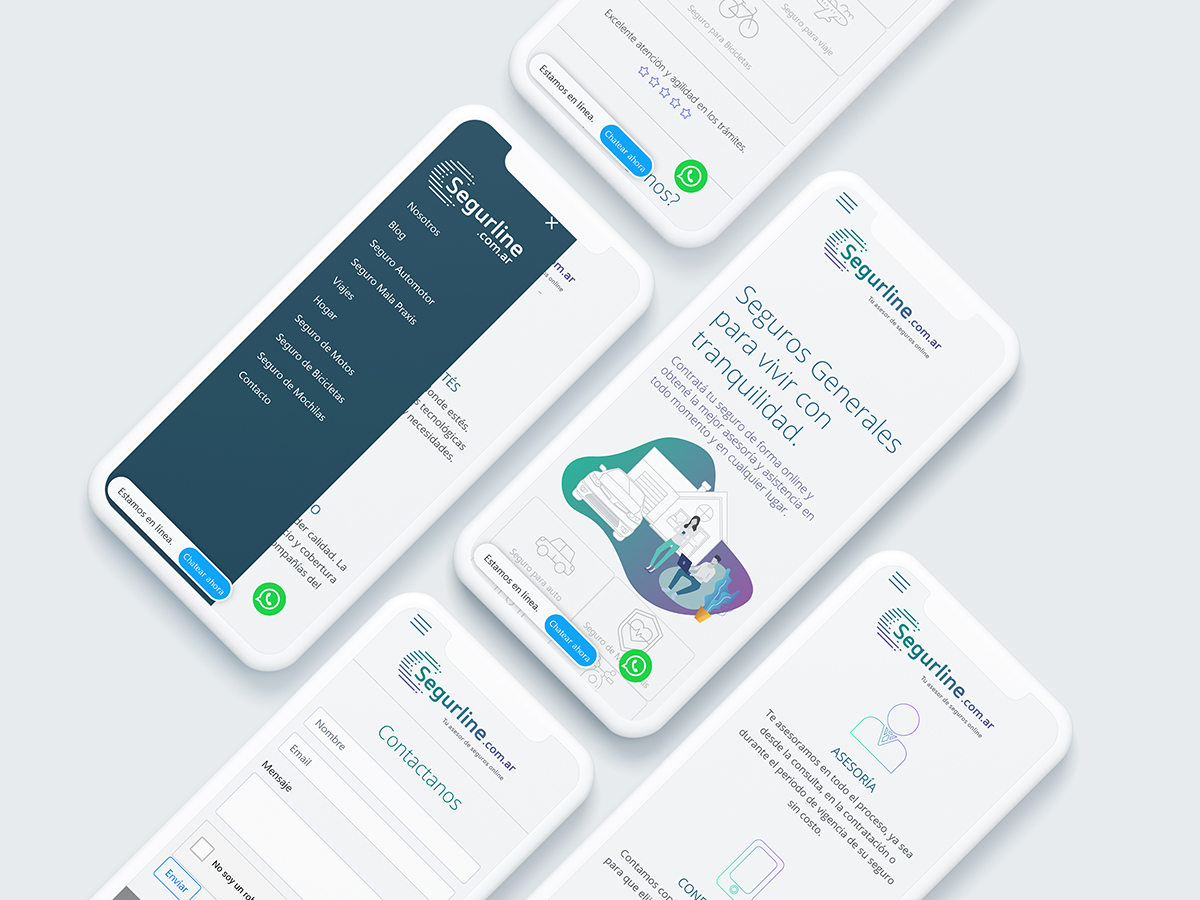
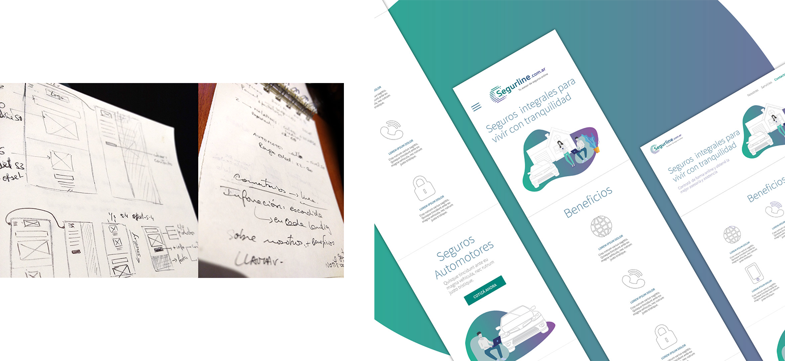
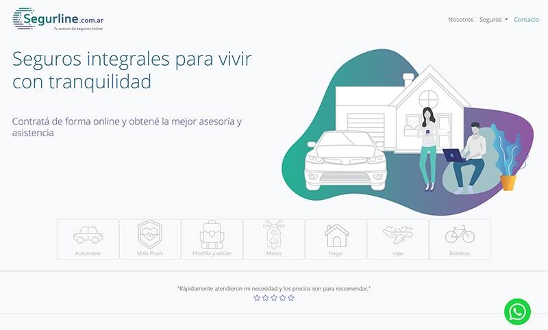
Early explorations leaned toward a single long homepage. As more services were added, the page became difficult to navigate. A keypad-like layout (fast scanning, direct product access) replaced the endless scroll and aligned with the client's "choose-what-you-need" preference.
Web dev & SEO
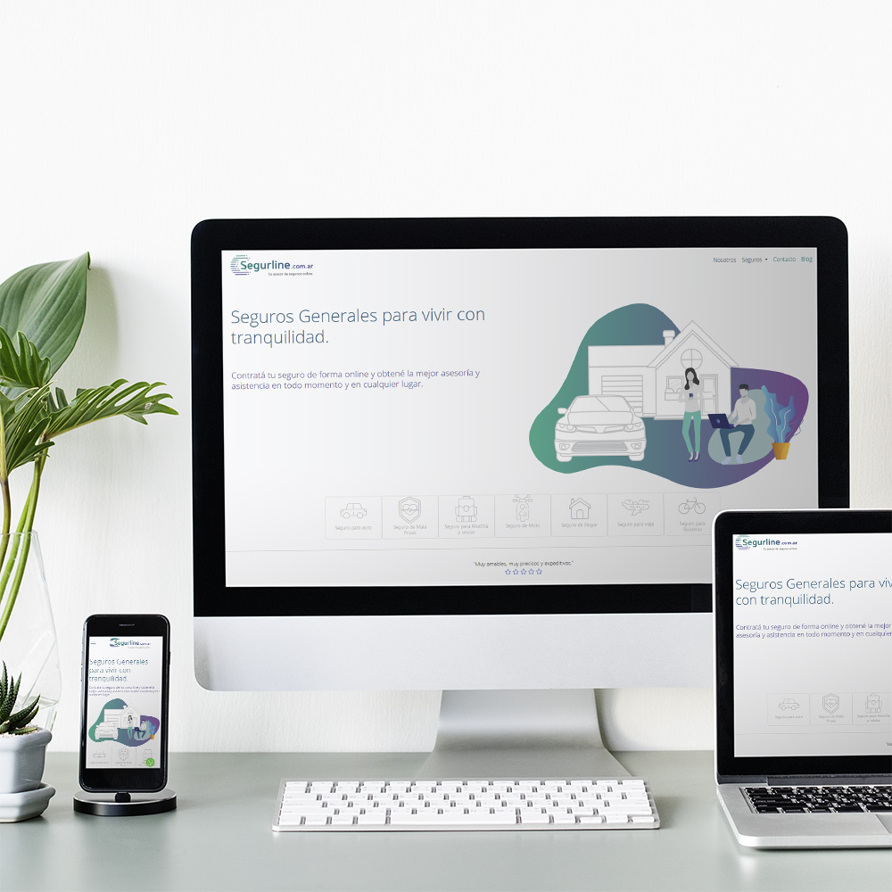
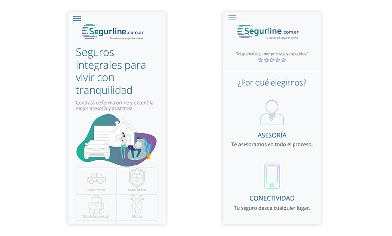
- Minimalist, clean aesthetic to convey professionalism and reliability.
- Consistent branding to reinforce trust and recognition.
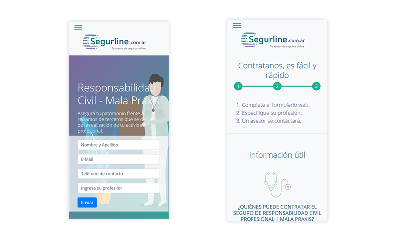
- Dedicated service pages for usability and SEO growth.
- Content-driven blog planned to support organic visibility.
Outcome & what I learned
Consolidating fragmented experiences into one structured platform improved navigation, reduced user effort and created a clearer path to service actions, laying foundations for scalable content and SEO.
- Structure beats volume: clear entry points matter more than adding sections.
- Trust is visual + informational: consistency, hierarchy and tone reduce uncertainty in insurance.
- Metrics: +8% web traffic and new tier clients within a month of launch.